
I admit it, I love typography. I didn’t always love typography, mainly because I didn’t have a good grasp of the subject. I didn’t take my first typography class until my junior year of college—mainly because that’s how the curriculum was set up. I went into it with pretty much no previous knowledge of typography, other than using my own judgement of “what looks good.” I have to admit, I was pretty intimidated by not only the professor, but also the students who had transferred to the university from the community college. They already had an associates degree, which means a foundation in this subject. It didn’t take me long to catch on [my professor was great] and soon enough I spitting out terms like “kerning, leading, tracking, Helvetica…” Taking a second typography course helped me appreciate it. The first go around I was learning and admiring, and the second time I was creating what I had previously admired. I could post pictures and pictures and pictures of typographic posters and images that I’m in love with, but I thought these two images are extremely helpful when learning about type and the language used.
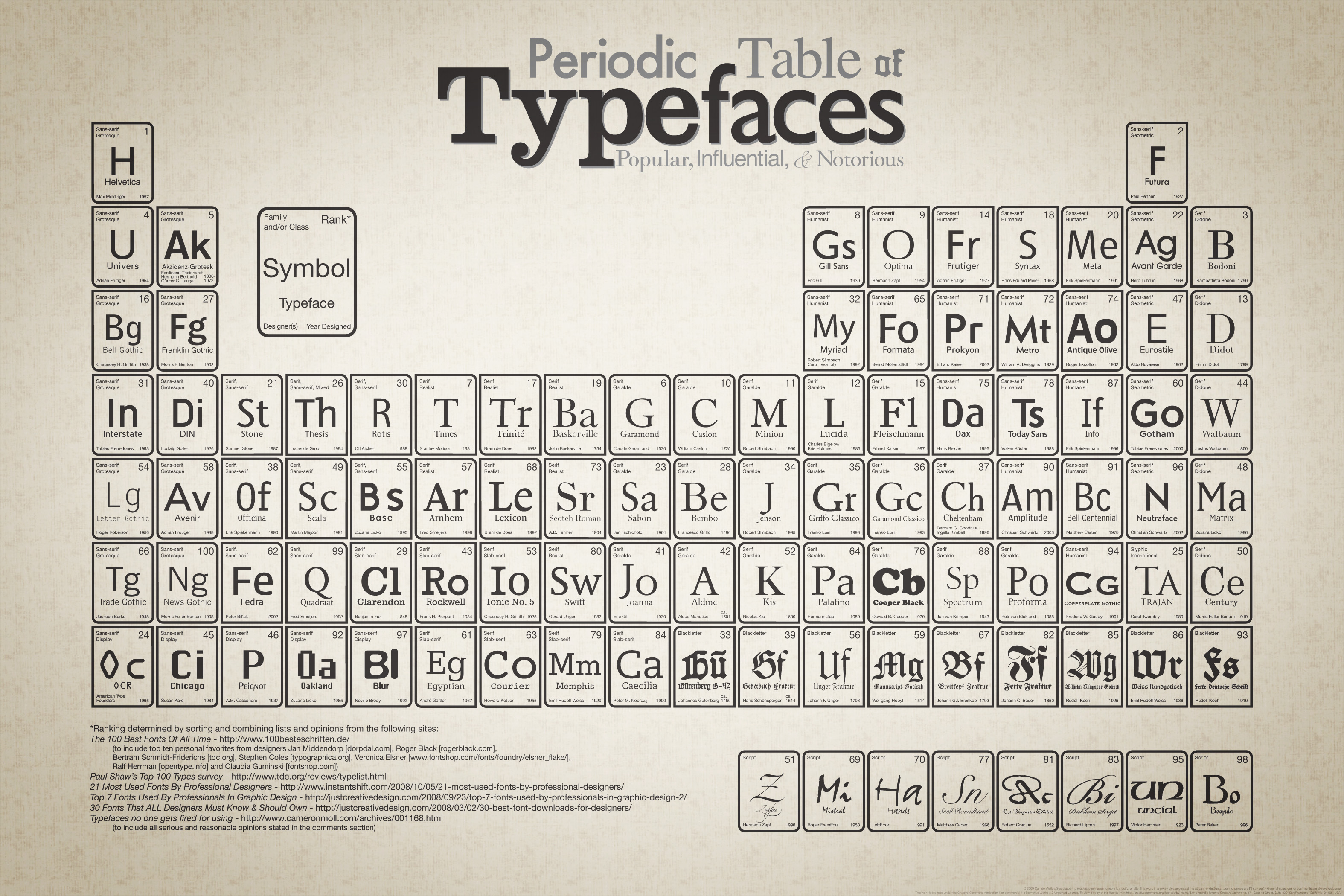
The Periodic Table of Typefaces by Cam Wilde. View the full details and close-ups of the print here. Buy a print here.

The Anatomy of Type by Sigurður Ármannsson. Read about his process of creating this and download the wallpaper here.

Bonus Piece!
I actually ordered one of these prints and have it hanging in my little cubicle at work. It’s from this neat place out in Portland named Inksie—”a brand, online community and shop based on well-designed products and the culture that embodies them.” They collaborated with Colorcubic, a multidisciplinary design studio also located in Portland. They created this using a letterpress [double-love] and Inksie’s four symbols. Watch the video of the poster’s printing process and buy it here.

—m.